Has it ever baffled you when you look at a compact, content-rich Chinese app design?
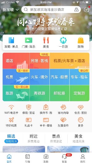
For instance, a popular traveling app UX design in China, Ctrip, looks like this:
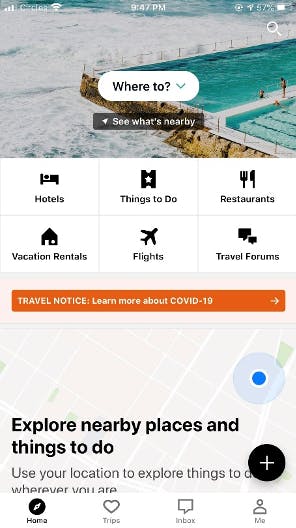
Whereas its American counterpart, TripAdvisor, looks like this:
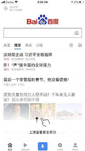
The most popular search engine in China, Baidu, has an interface like this:
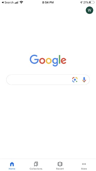
Whereas Google stands in steep contrast with its minimalist interface:
As a UX designer who was born in China and studied overseas, China web design trends have certainly piqued my interest. For the longest time, I was pondering what could have attributed to the unique design philosophies. It definitely traces back to culture—but what ingredients specifically have instilled the different flavors into the UX designs of Chinese and Western mobile apps?
In this article, I would like to share with you three hypotheses that could potentially explain the differences.
Mobile apps in China vs. the West
“Mobile in the US is a dessert. In China it is the main course.”
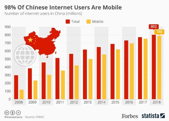
To many Chinese, the Internet is mobile. Based on the data released by CNNIC, 98% of Chinese netizens use mobile to access the Internet as of 2018. Granted, many of them are multi-platform users, which means they access the internet via Mobile, Desktop, and Tablet. However, a much more significant portion of Chinese uses Mobile as the primary means to access the Internet. They have leapfrogged the use of a desktop, or a laptop, launching directly into the nifty pixels at their fingertips, the mobile phone.
Therefore, the mobile platform needs to act as an entry point to the full array of services for both educational and practical purposes. A new breed of app was born — the super app.
In the West, majority of people were introduced to the World Wide Web via a computer. When the smartphone was first introduced, its features were pretty bare-bones, where the early technological constraint as well as people’s learning curve had limited the functionalities supported on a mobile.
Subsequently, with the continuous evolution of the digital sphere, “mobile first” emerged as a philosophy. This philosophy has encouraged designing with mobile users in mind first, focusing on placing only the essential features on the limited mobile real estate, which has probably contributed to a more minimalist and streamlined style of mobile design.
Physical and digital spaces
“Show me what your home looks like, and I can tell what kind of person you are.”
The second theory posits that perhaps the digital design is partly an extension of physical environment design.
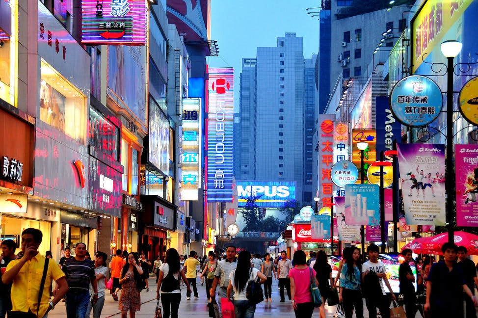
If you have ever been to China, you would have certainly noticed that the urban space is bustling with activities, and the level of sensory load is much higher compared to where you come from. It could look something like this:
Whereas in the US, most people live in the suburbs that looks like this:

And even in its urban area, the level of sensory load probably isn’t as high as in China:

Because people are accustomed to the space they live in, they will impart similar qualities into digital designs from the physical environment.
Chinese New Year decorations, which are usually viewed as the culmination of Chinese elements, could probably illustrate this point the best:
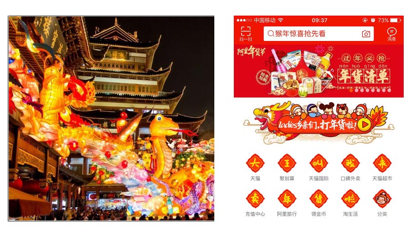 If we are to use the design language, we would probably say that the colour palette, typography, and iconography (for both the online and offline environment) are strikingly similar—in other words, they are quite consistent in style.
Generally, in China and some of the Asian countries, people who live in densely populated cities are more used to the high level of sensory load in their urban environment. It is associated with a sense of convenience and abundance, however also a sense of over-clutter. This has seeped into the digital design as well. On which end of the spectrum would you perceive it probably depends on where you come from.
Design in Chinese vs. design in Western languages
“Your interface is as complex as your language.”
Last but not least, let’s take an anatomy of the Chinese and English characters, shall we? Below is an image showing the most commonly used word — “You” in both English and Chinese.
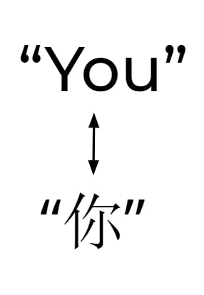
Some of the key differences become obvious almost immediately:
Layout
- Chinese characters are two dimensional
- English characters are linear
Number of strokes
- Each English character has about 1–3 strokes
- Chinese characters, like the one on top, have many more strokes — specifically, “你” has 7 strokes, and the most complex character in Chinese is said to have 57 strokes
Character set
- Over 50,000 Chinese characters
- 26 English characters
It's no wonder that Chinese is recognised as the most difficult language to learn in the world—it is almost insurmountable to master 50,000 Chinese characters, although it is commonly advocated that you just need about 3,000 characters to be able to read newspapers and signposts.
So based on this great post on Quora, the theory is that, in cultures that use more complex alphabets, people’s brains are highly trained to parse large amount of data, and therefore accustomed to finding information and digesting it quickly.
If this is indeed the case, then perhaps we can infer that other cultures which have weaved complex alphabet sets into its language would similarly have a complex interface.
Well, check out the Japan Yahoo website, which boasts the highest traffic in the nation.
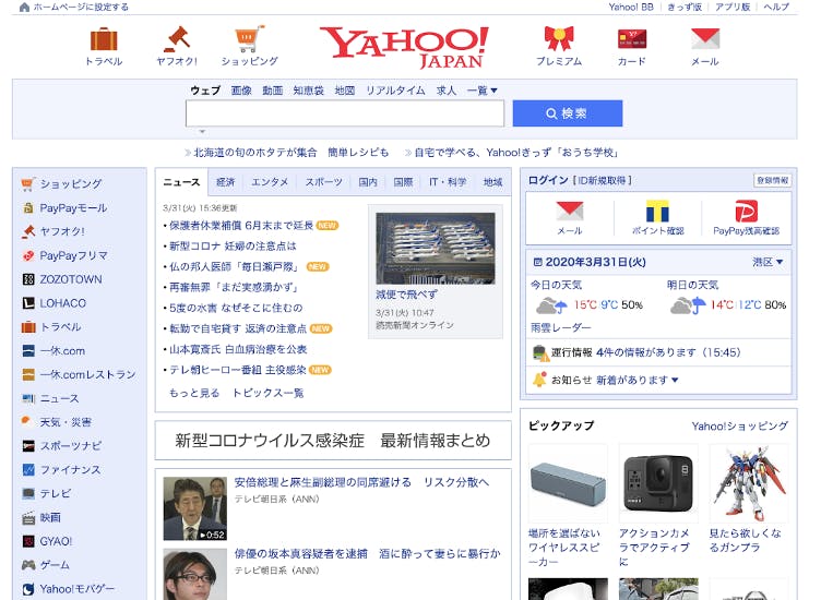
It may just well be that this theory does have teeth.
What can we learn from Chinese app design?
No matter what you are designing, remember the greater context.
A design doesn’t exist devoid of a context. Sometimes the context has more to do with cultural background, sometimes the physical environment, and sometimes the state-of-mind the user is in. No matter what it is, you ignore it at your own peril in developing digital products.
We’ve already seen how cultural context has shaped the UX design and UI design of Chinese apps and Western apps. Another example is how Grab designs its app for drivers who often use it in the context of delivering on the road under the sun. The Grab designers ensure that the color contrast will still work in those circumstances by dimming the screen, standing near a window in bright sunshine, and checking on the legibility of the key interface elements.
People are creatures of habit.
Know when habits will help people adopt your designs faster, and when these habits could present potential challenges. Present the UX design in a Chinese app to a Westerner and he/she would likely feel that it is too cluttered to be usable, whereas if you present a Western app to a Chinese, he/she would likely feel that it’s very skeletal with little functionality. Those reactions come off ingrained deeply in their habits.
But if you design your product leveraging the existing mindsets and habits of your users, you could reap handsome dividends.
For instance, one of the most widely seen patterns in design — the tabs, have roots in a real-world object: tabs in organising files.
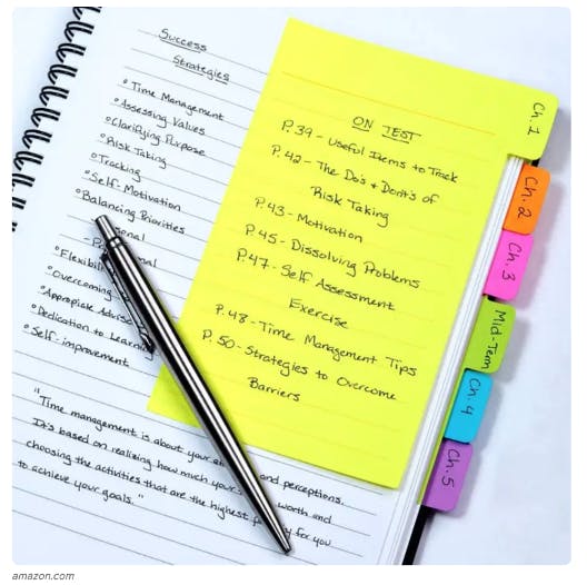
Photo credit: Amazon
People are used to them in their daily lives, which transfers quite seamlessly into the online world, and even people who see it for the first time are likely to “get it” immediately. As designers, nothing is more satisfying than seeing our design click naturally into the world of the users, and to do that, you want to know when and how the users’ habits will work for or against you.
Before closing this off, I’d like to present you with a bonus: As UX designers, we don’t simply take everything in without some level of questioning and deeper digging. When a hypothesis is formed, the next step is always to test it further. So I’d encourage you to look at the theories put forth here with a critical thinking mindset. That way, you will be able to design more impactful products.
If you have any further thoughts/comments on this article, feel free to contact our team, we'd be happy to discuss!

PALO IT UX Design across the world
- Find out more about our UX design team in Hong Kong.
- Read up on our successful UX design projects in Mexico and LATAM.
- See what our Singapore UX design team has to offer.
- Check out our Thai UX design team based out of Bangkok.