
Most designers agree that accessibility is a crucial factor in creating user-friendly UX design and UI design. Yet, it’s often the first item to deprioritise due to limited resources and time, as it’s often more reasonable to focus on the majority of your product’s target users. But, by doing that, we may be excluding the world’s largest minority group, the one billion people globally who experience a disability, and missing out on the inherent, universal benefits of making your digital products and services accessible and impactful.
What is accessibility design?
Accessibility design refers to a design that bears an equivalent experience for anyone, regardless of who they are and how they interact with products. Some common practices include ensuring colour contrast, securing the size of touch areas, and providing image/video captions.
There are several potential accessibility issues that users may have while interacting with digital products. Some of the most common include:
- Visual impairments (e.g. colour blindness, low vision, blindness)
- Mobility impairments (physical disabilities)
- Auditory impairments (hearing difficulties)
People who have these accessibility issues may not necessarily fall into the disabled demographic. For example, those who break an arm may not being able to use a mouse, or older populations may have reduced vision that leads to difficulty reading.
Why is accessibility important in digital product design?
Accessibility design has the potential to change how we create products and deliver content. Considering accessibility in UX&UI design also improves the usability of digital products and benefits a much larger user group (also referred to as The Curb-Cut Effect). For example, closed captions are most often created for users with auditory impairments, but they also enable users to watch videos in a noisy environment.
In some countries, accessibility design isn’t an option, it’s a legal requirement. Companies like Nike and Amazon have faced issues in inaccessibility because of the Americans with Disabilities Act (ADA) in the U.S. In Europe, there is a European Accessibility act serving similar purposes. In Hong Kong, the Disability Discrimination Ordinance (Cap 487) also states the legal responsibility of ensuring accessibility in digital applications.
The good news is more global brands like Apple, IBM, Spotify, and Decathlon are all actively transforming their digital strategy for accessible design. The following are some best practices that PALO IT team implement in our work. They demonstrate accessibility design in action.
Application of accessibility design
When applying accessibility to design, the four principles below, suggested by Web Content Accessibility Guidelines (WCAG), often serve as the foundation.
- Perceivable: information can be perceived by at least one of a person’s senses.
- Operable: interfaces are operable through a variation of interaction
- Understandable: interaction and information should be understandable
- Robust: content can be accessed through a variety of (assistive) technologies
Principles are all well and good, but let’s take a closer look at how they’re implemented...
1. Ensure colour contrast for visual elements
*Principle: Perceivable
This can benefit:
- People with visual impairments like blindness, colour blindness, or low vision due to aging
- People who are using digital products in strong light environments
The purpose of creating a minimum luminance contrast ratio between visual elements and its adjacent colours (e.g. background) is those mentioned above can access content with sufficient readability. Other factors like font size and lighting conditions are also important to consider. In product design, we can address this with the most common standard suggested by WCAG, using tools like: Material Colour Tool or Stark Figma Plugin:
For text elements, see the chart below, or read more on the rationale for the ratios chosen.
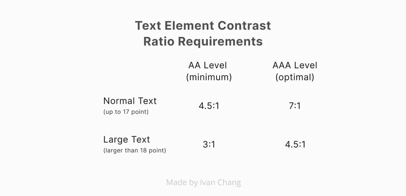 Contrast ratio requirements for text elements; people who cannot access content with 7:1 contrast ratio usually will utilise assistive technologies such as magnification.
 For non-text elements, it is suggested to ensure the contrast ratio of a component’s colour and adjacent colour passes 3:1.
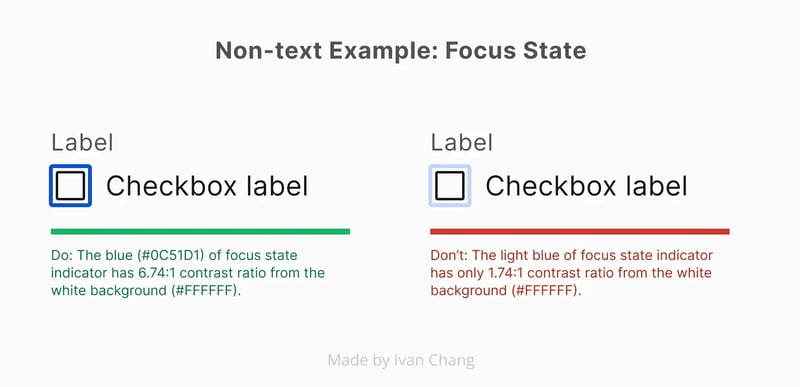 Example: having legible visual indicators for focus state allows keyboard users to identify the focused element easily.
Some situations do not require the fulfilment of this minimum requirement. For example:
- If components use several colours, any colour which does not interfere with identifying the component can be ignored for the purpose of measuring contrast ratio (e.g. drop shadow).
- Logos
- Incidental text of an inactive and/or decorative element (e.g. button text of an inactive button).
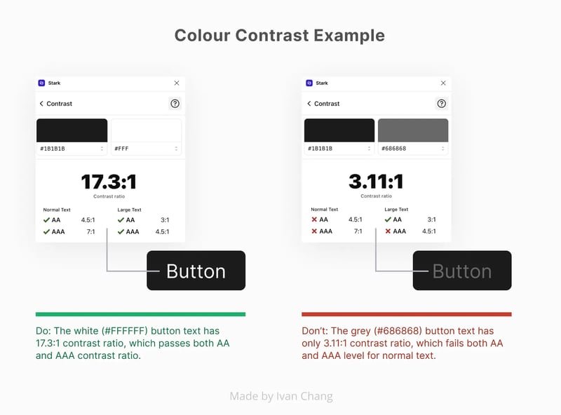
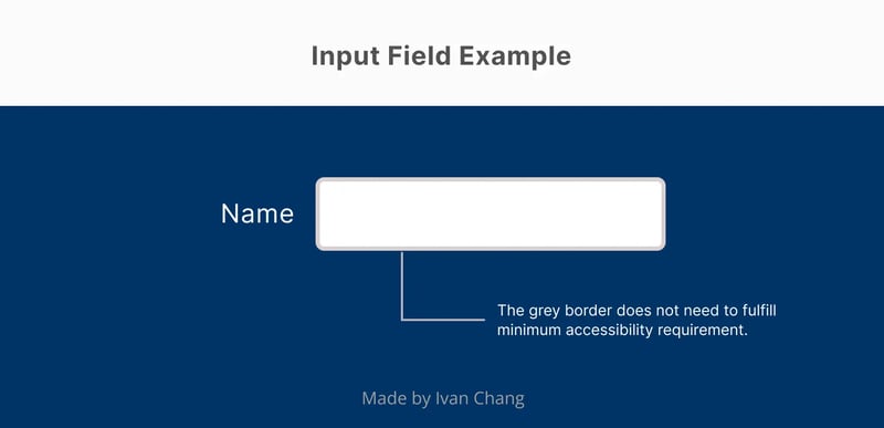 We only need to consider the contrast ratio between blue background and white fill of the input field, since the grey border does not interfere with identifying this component.
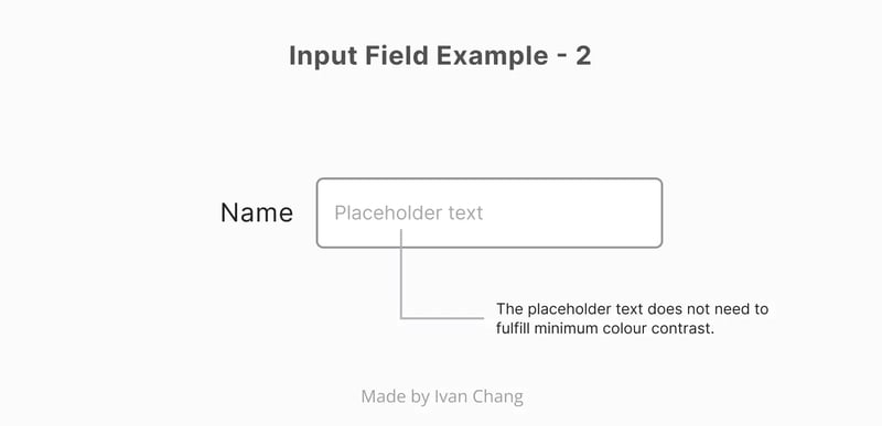 The placeholder text does not need to fulfill minimum contrast requirements since the border of the input field has already provided the visual indication.
We also need to consider usage context, such as branding guidelines. Some examples from around the industry can give you a glimpse of how they ensured colour contrast:
- Spotify redesign their most important buttons concerning the accessibility
- Polishing GitLab’s UI: A new colour system
- Text, contrast, and accessibility in Shopify
2. Do not rely on colours as the only indicator for signifying and separating information
*Principle: Perceivable and understandable
This can benefit:
- People with colour blindness
Do not convey different information using colour alone. Using additional visual cues in UI design, such as text labels, glyph shapes, or patterns ensures all people can distinguish between them. Below are two examples from Square and Apple.
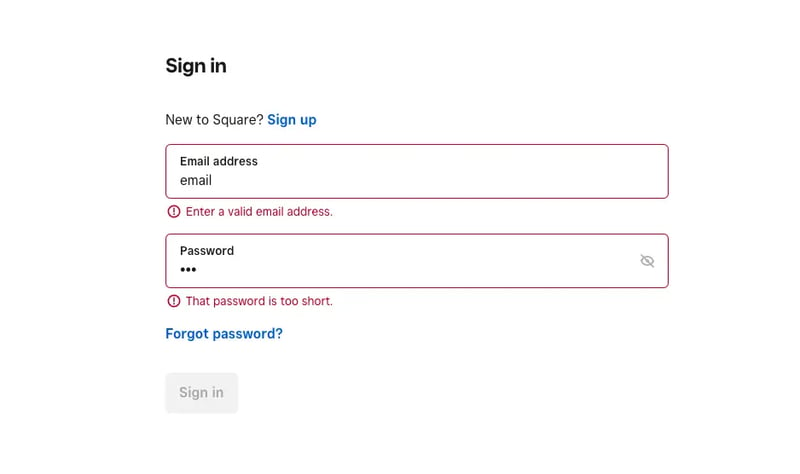 Adding icons and assistive messages to elevate the error in an input field by Square.
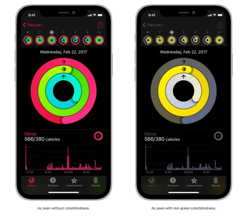
Adding icons to indicate different data of a chart by Apple.
If possible, choose a colour palette that is colour-blind-friendly before diving into the design of the product.
3. Provide alternative text for images
*Principle: Operable and Robust
This can benefit:
- People with serious visual impairments like blindness
- For website owners; good alternative text can improve SEO
Alternative text (or alt text) helps describe images and other graphic elements in text with a short label in the code, which can ensure people who cannot see them can still understand what is displayed through screen readers (e.g. VoiceOver on iOS; TalkBack on Android). The information will also appear when an image fails to load. For marketing purposes, keywords inside alt text can improve search engine optimisation.
A few reminders to keep in mind when writing alt text:
- Keep it short and simple
- Do not replicate captions, since both will be read out by screen readers
- Decorative images do not need alt text
- Functional images (e.g. logos, icon buttons) should have alt text that explain their function
 An example of good alt text from PALO IT.
Moreover, using a clear heading hierarchy for each page enables users who use screen readers to navigate digital products with ease. A job listing company, Indeed, has provided a great toolkit on Figma to help you understand and apply a clear heading hierarchy.
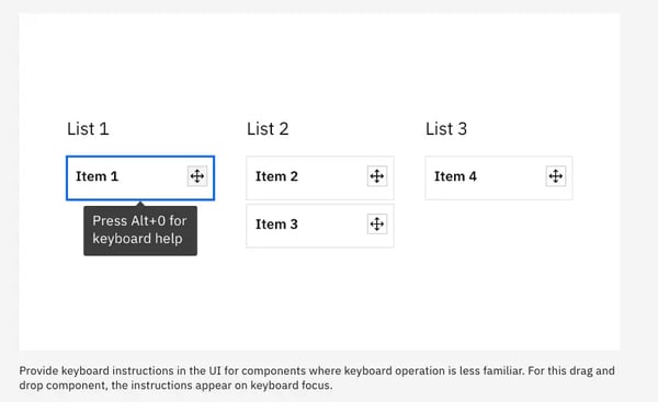
4. Enable keyboard accessibility
*Principle: Operable
Who can benefit:
- People with physical disabilities who cannot use a mouse
- People with serious visual impairments that cannot see cursors on screen
- People with chronic conditions that limit the use of a mouse (e.g. repetitive stress injuries)
- Productive users who prefer to navigate interfaces efficiently with a keyboard
Keyboard accessibility allows users who rely on/prefer using keyboards to interact with content and elements in digital products (e.g. using ‘tab’ to navigate to the next element on a website). Users are able to navigate, perform the same tasks as users who use a mouse, and locate elements with focus indication. Allowing this kind of interaction will also enhance overall user experience for all.
It’s also important to input and manage a logical and predictable keyboard focus order, providing users with a hierarchy when navigating content. Common practice to match visual flow is left to right and top to bottom.  An example of focus order annotation by Microsoft, Fluent Design System.
 Tooltips may be displayed when a component is on keyboard focus by IBM, Carbon Design System.
Some native elements on websites already have built-in keyboard accessibility. Referring to existing guidelines by MDM can be a good starting point on that topic.
Conclusion
While accessibility design benefits those with disabilities, at PALO IT, we believe accessibility design can create positive impact to all users by providing a better overall experience. We aim to advocate its value and importance to a broader audience, and urge every developer, UX designer, UI designer—individuals and businesses alike—to start leveraging that value in their products and services.
Design with accessibility, and you can’t go wrong.
To start designing with accessibility in mind, learn more about PALO IT’s UX design and UI design services, or get in touch with our team to learn more about how we merge purpose and profit through design strategy.