
I am particularly keen on design systems and by that I mean obsessed. I often read online articles and enjoy studying the design systems of different organisations.
In this article, I shall not delve into the definition of a design system or how to start one — Google ‘design system’ and I’m sure you’ll find a ton of resources. Instead, I’ll be sharing more specific learnings from my experience working with and building one. Hopefully, these insights will help you build your own design system more efficiently.
1. Get buy-in across teams
This is the most important step to me — a design system is all about improving collaboration between teams. Therefore, it’s important to let these teams in on the process:
Design team
When you are working on an existing design system or building one from scratch, share your approach with both your internal design team and your client’s design team. What makes sense to you might not work or adequately cover the scenarios they are working on.
Front-end team
It’s always a good practice to check in early and frequently with your developers. There is nothing worse than spending time, effort, and money to create a component only to realise later that it may be too complicated to implement or may not work well with existing code.
Business team
One of the most common responses I receive whenever I begin this process is “Why?” It may seem unnecessary to talk to your business team about a design system. However, explaining to your business team what a design system is, the value it brings to the business, and why your products need to adhere to the design system is an important step to minimise friction. (Getting buy-in from the design and front-end team will also help!)
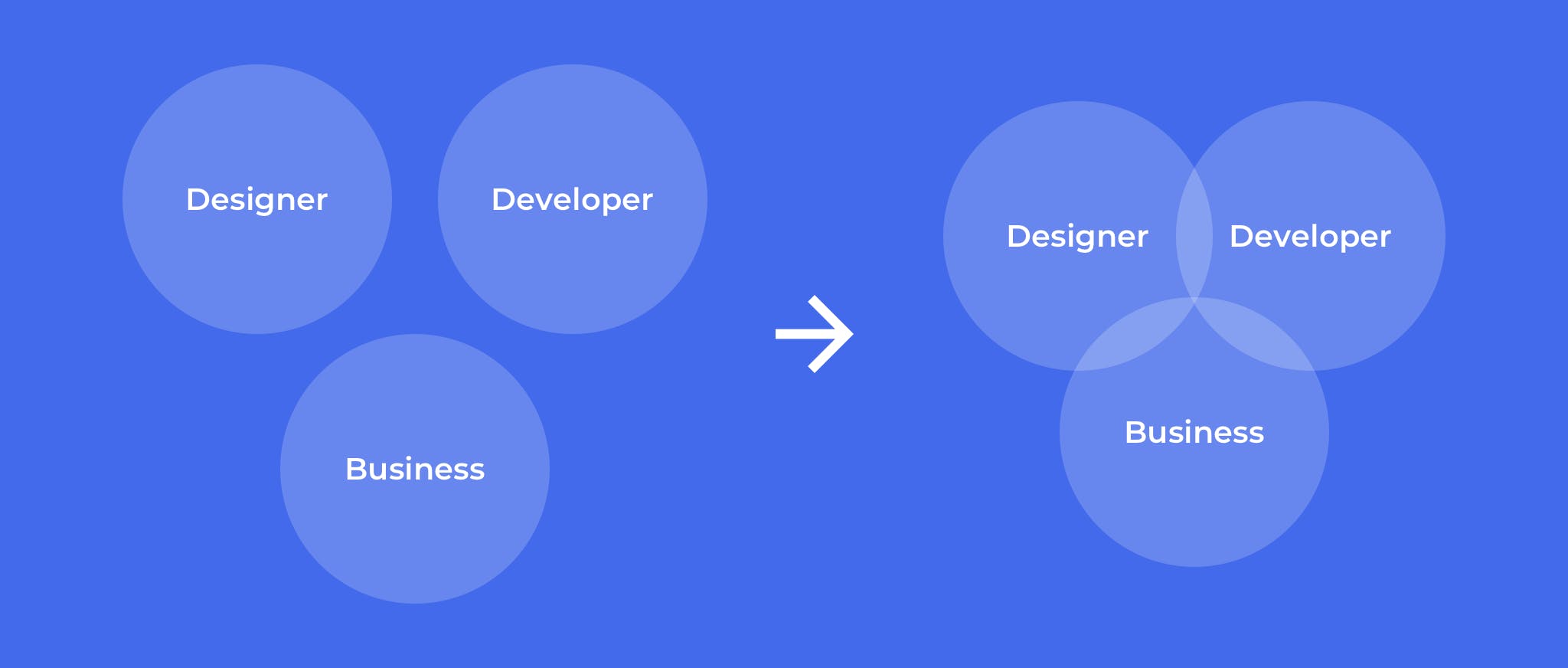
No buy-in vs. with buy-in
Every team has a different language. Understanding what brings value to each team and framing it in a way that is relevant to them is key to getting buy-in across teams.
Key takeaway: Involving different teams in the process helps to challenge your assumptions. Furthermore, it helps to validate what you are creating is something that users can not only understand, but also want to use.
2. There’s no one-size-fits-all solution
When I first started working, I had a grand plan of creating the perfect design system by meshing the best practices from established design systems. I considered many things like — What were the best font sizes to use? What were the best spacing rules to follow? What was the best interaction for the component?
But after scouring through countless articles and checking out awesome design systems from Atlassian, Google, Shopify, and more, I realised that there was no such thing as perfect. Each design system had its own purpose and goals. Therefore, understanding the needs of your product and teams, as well as how it will be used will help you decide what works best for your design system.
Key takeaway: Look at the design system as a living document that should constantly evolve along with your products, tools, and technology. You may not get it right the first time but that’s alright — just try and try again!
3. Align on terminology
This may seem pretty obvious, but what one thing means to you may mean something entirely different to someone else. For instance, a designer may use the term ‘dialog box’, while a developer may refer to it as a ‘modal’ and a business team may simply call it a ‘pop up’. Referring to the same component by different names creates confusion between teams or even teammates, resulting in additional time and effort to communicate and clarify.
Key takeaway: Collectively discuss and establish the terminology that will be used throughout the documentation in advance.
4. Keep it simple — design only what you need
If I find my teammates asking me where certain components are, how it works, or notice them taking more time than they should to decide between what components to use, I’ll make a mental note to look into those areas.
I believe that a good design system should be intuitive to use. I’ve come across design systems with a comprehensive library of fonts, colours, and components — some of which may not have an actual use case at all but are just there for the sake of it. While I understand the intention of providing more variety, having unnecessary choices may create inconsistencies and increase the decision points designers have to make.
Key takeaway: Every component in the design system should be intentional, thoughtful, and reusable — create them with actual use cases in mind. Regularly check in with your teammates to ensure that you’re creating a design system that adds value to their workflow.
5. Create a formula for scale
It’s not uncommon for designers to create based on what they see on their own screen. Using a formula is often neglected for things like type, icons, spacing increments, interactions, or behaviours.
E.g. Using a constant multiplier to derive font sizes and line heights creates a clear hierarchy for all types of experiences vs. random font sizes created based on what designers deduce from their own screens.
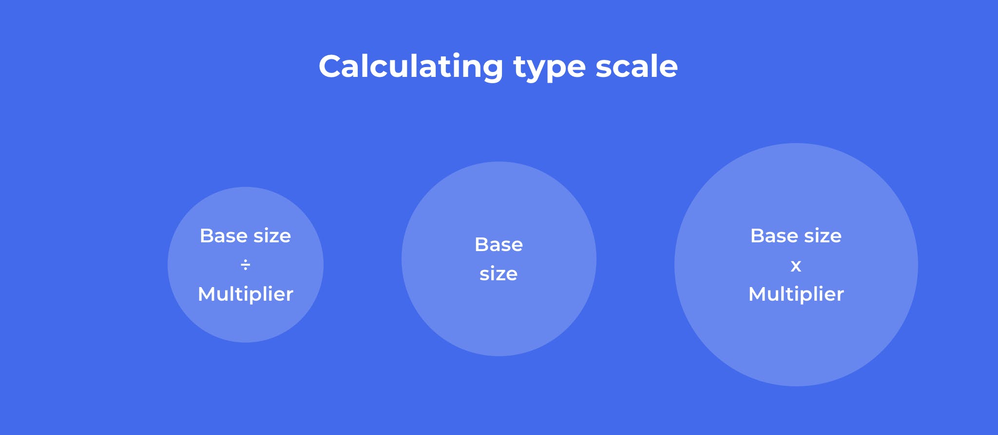
Formula I’ve used for calculating type scale
Key takeaways: Using a formula makes it easier to scale design systems and remember variations off-hand.
In conclusion, there are no hard and fast rules when it comes to creating a design system. However, to find out what best works for you, one mustn’t neglect collaborating with teams, understanding product needs, and acquiring constant feedback.